01
Audit every key viewport and breakpoint
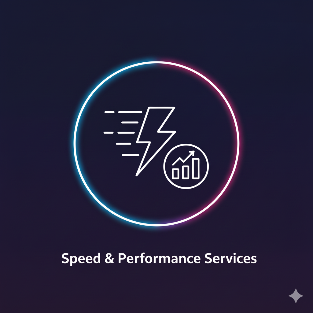
Performance & Responsive
We transform your current layout into a fully responsive structure, auditing breakpoints and enforcing consistent grid + CTA behavior. Shopify and WordPress themes fall outside this scope.
15 min · Free strategy mapping
Audit every key viewport and breakpoint
Validate touch and hover components
Serve critical CSS and font performance fixes
Run Lighthouse QA on phones and tablets
Map templates, breakpoints, and component inventory.
Fine-tune grids, CSS, and media queries for smooth scaling.
Execute cross-device testing, visual regression, and handover docs.
Send your URL and describe frame-rate issues; we will deliver prioritized fixes plus mobile render tests.
Standard reply within 24 h; express runs are scheduled the same week.
15 min · Free strategy mapping